When you scaffold a new SharePoint Framework web part, you get a blue box with white text. While this looks good as a banner-type component, if it was included on a page with other content, it may not look as good. In this post, I will show you how to add a property to toggle the display between "dark" mode and "light" mode.
The code for this post is at https://github.com/pschaeflein/spfx-dark-light-mode-sample
Add a property
The property pane for a web part is well documented. (And the page on pre-configuring web part properties has step-by-step instructions for adding properties.
To include a toggle on the property page, I implemented the getPropertyPaneConfiguration method with the additional control in the groupFields section.
{
  groupName: strings.DisplayPropertiesGroupLabel,
  groupFields: [
    PropertyPaneTextField('title', {
      label: strings.TitleFieldLabel
    }),
    // new field here
    PropertyPaneToggle('displayModeDark', {
      label: strings.DisplayModeLabel,
      offText: strings.DisplayModeLightLabel,
      onText: strings.DisplayModeDarkLabel
    })
  ]
}
You may need to add the PropertyPaneToggle object to the import statement. Since the generated code uses localized strings, the IHelloWorldWebPartStrings interface in file src\webparts\helloWorld\loc\mystrings.d.tx needs the new properties, and the en-us.js file needs to include them as well.
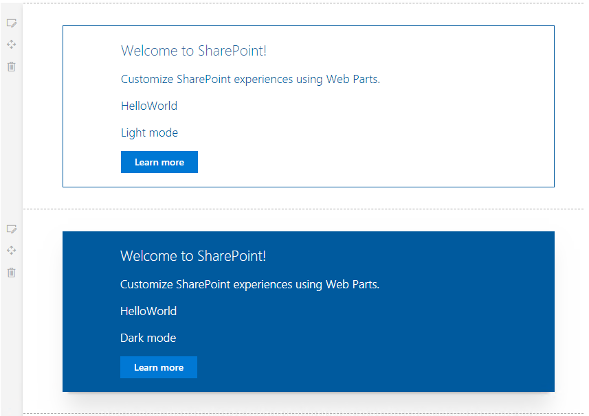
The default style of the web part has white text on a dark background, I updated the manifest to set the default value of the displayModeDark property to true.
I updated the web part render method to include the value of the display mode toggle (the following lines are directly under the subTitle paragraph):
<p className={ styles.description }>{escape(this.props.description)}</p>
<p className={ styles.description }>{(this.props.displayModeDark) ? "Dark" : "Light"} mode</p>
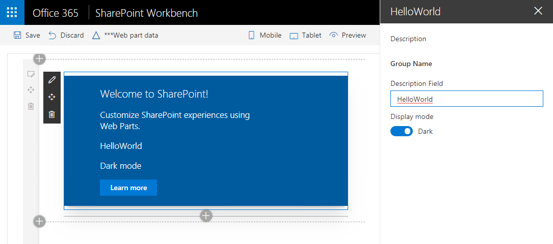
With these updates in place, the sample web part and property page look like the following:
The last step is to update the CSS classes to render the correct background/font colors. In the components folder, open the *.module.scss file to update the CSS classes/rules.
- Remove the line
@include ms-fontColor-whitefrom the following classes:.title.subTitle.description
- Duplicate the
.containerclass. Name the new class.containerLight. Rename the existing class.containerDark. - Remove the
box-shadowstyle from the.containerLightclass.
The classes for the containers should look like the following:
  .containerDark {
    max-width: 700px;
    margin: 0px auto;
    box-shadow: 0 2px 4px 0 rgba(0, 0, 0, 0.2), 0 25px 50px 0 rgba(0, 0, 0, 0.1);
  }

  .containerLight {
    max-width: 700px;
    margin: 0px auto;
  }
- Duplicate the
.rowclass. Name the new class.rowLight. Rename the existing class.rowDark. - Modify the
.rowLightclass to use a border color instead of a background color and use the theme color for text.
The classes for the row should look loke the following:
.rowDark {
  @include ms-Grid-row;
  padding: 20px;
  @include ms-fontColor-white;
  background-color: $ms-color-themeDark;
}
.rowLight {
  @include ms-Grid-row;
  padding: 20px;
  @include ms-fontColor-themeDark;
  border: 1px solid $ms-color-themeLight;
}
Lastly, the React component for the web part is updated to conditionally include the proper CSS class:
<div className={(this.props.displayModeDark) ? styles.containerDark : styles.containerLight}>
  <div className={(this.props.displayModeDark) ? styles.rowDark : styles.rowLight}>
With all of these changes coded, the web part can be shown in light or dark mode.