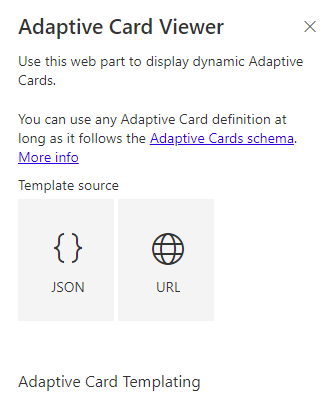
In the PnP Samples repository, Hugo Bernier created a web part that renders an Adaptive Card. I modified that sample to leverage React Hooks as an exercise to learn the technology. This post will summarize the changes in the hope it will help others understand React Hooks.
I am certainly not an expert in writing Typescript/React code, so any input is greatly appreciated! You can open an issue in the repo, or hit me up on the Twitters.
Components of the solution
- AdaptiveCardViewerWebPart.ts
The webpart file remains a class. I had no appetite for undoing all the generator gives us, so still a class. This class has two responsibilities:
- Web part properties
- Render the "root" functional component
The web part implements getPropertyPaneConfiguration as usual and also implements the render method.
- RootComponent.tsx
This is a React functional component. Its purpose is to manage the state for the React "app". So, most of this component is the useEffect hooks from React. One hook depends upon the web part properties, so changes made in the property pane can trigger a re-render. Other hooks depend upon the various Http calls. Also, the component initializes a React context provider, exposing the SharePoint context.
- Card/SPList Data Services
The services are written as React hooks. They are functional components, meaning there is no "this" object to store data. Dependences are passed as input parameters (primarily the SharePoint context) and the "outputs" are pushed to app state via a React Reducer hook.
- Service Reducer
The service reducer is simply "reducing" all the Http calls to a set of generic actions. These actions map closely to Http state: initializing, fetching, complete w/success, complete w/failure. I find it easiest to think of the reducer as publisher of events. Any other component can "subscribe" and process those events.
- State Reducer
The state reducer models all the changes to state that are possible. In this web part, that is changes to the Adaptive Card template or data, or changes to the (site/team) theme, and transitions of the Http client state.
Walking thru the components
The AdaptiveCardWebPart.ts is loaded by SharePoint. All updates to properties (via the property pane) cause the render method to execute. The render method instantiates the RootComponent, passing the properties as well as the SharePoint context.
The Root Component initializes the app state and uses hooks to "subscribe" to changes in the web part properties and the data services. There is very little business logic - it simply dispatches updates to the state reducer depending upon the properties it is passed.
The AdaptiveCardViewer component uses React Context to observe the state from the Root component. It will display a spinner if necessary, otherwise it will load the AdaptiveCardHost component.
The AdaptiveCardHost component contains most of the "business logic." It renders the UI based on the properties, which in this case is either the Adaptive Card or prompt screens instructing the use on how to configure the web part. Since the SharePoint context is stored in the React context, the AdaptiveCardHost can access the SharePoint context, allowing it to open the property pane. In the typical class-based approach, the button handler would be defined in the web part class and passed all the way down to this component via props. No more property drilling!
The AdaptiveCard component is a React class component. That is simply because it works and did not need to change. ;)
I hope you find this sample and blog post informative.
