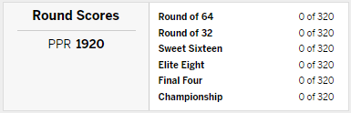
It is the time of year when millions watch college basketball, with one eye on their computer screen to see how their bracket is doing. As I filled my bracket, yet again, on the ESPN Tournament Challenge site, I was reminded of how their results page is misleading. The following is the Group results page, which will show the per-round breakdown of points:

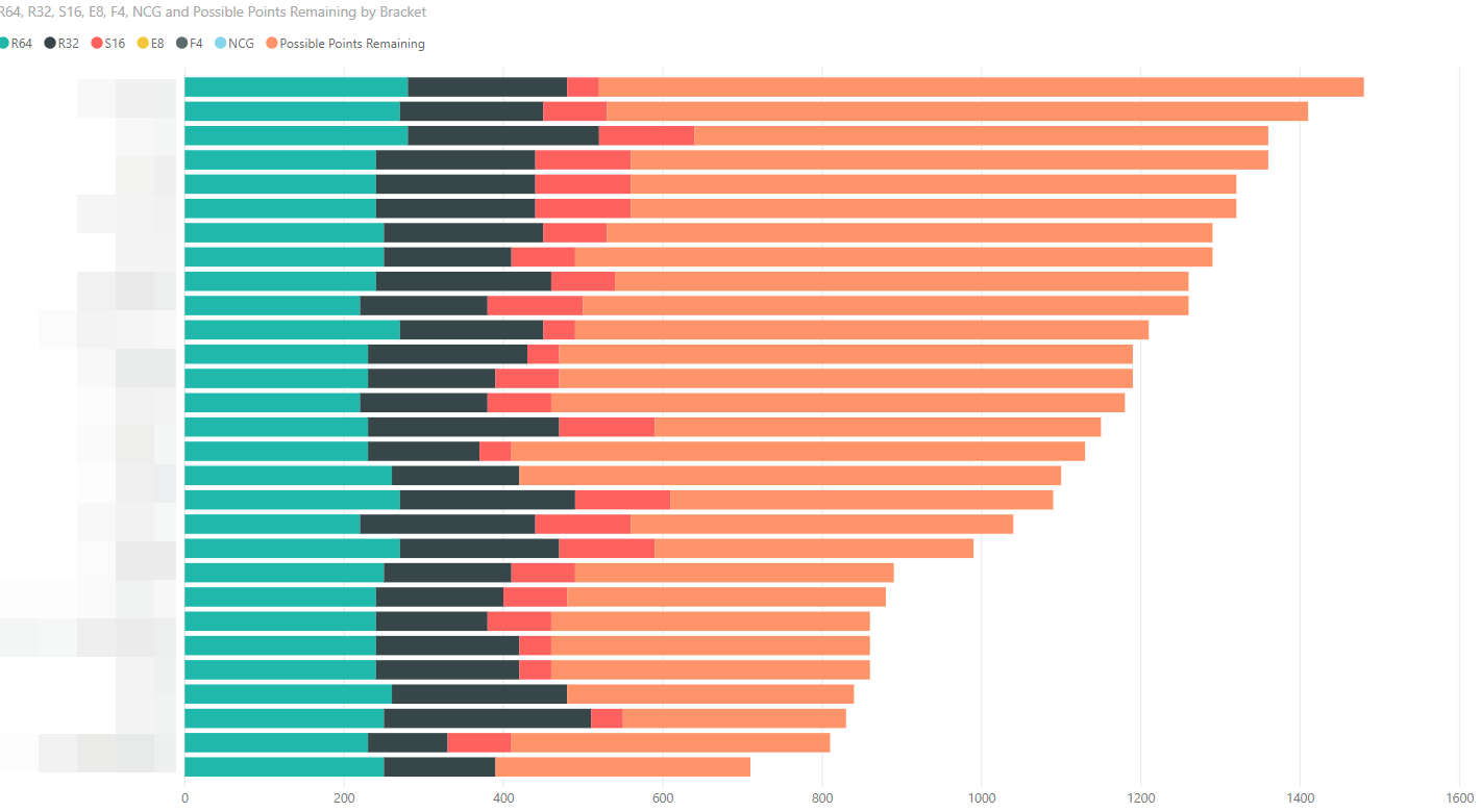
During the tournament, this page is misleading. If you click into a bracket, you are shown a similar breakdown, but with an additional data point - Possible Points remaining:
As an example, at the mid-point of the tournament last year, my group standings looked good for Blando and TuneSquad, while hattrick_134 and Valpo1 were struggling. 
But, factoring in the PPR, and presenting the numbers visually tell a different story.
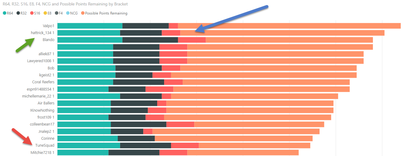
Notice the large gap in the Sweet Sixteen (S16) round. Even winning a few games is ok, as long as the predicted champion or runner-up make it thru!
Office 365 has all the pieces required to build this solution:
- PowerBI to create the visuals
- OneDrive to host the Excel file containing the data
- Flow to update the Excel file as results are published
Sadly, none of the technology can tell you which teams will win the games. But there are plenty of sites that will do that for you!
Have fun! And good luck!