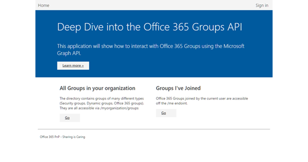
I submitted a sample to the PnP repo this week, and I used the opportunity to include the Office UI Fabric in the project. Below are random thoughts about the offering, in no particular order:
-
The font is very small. This may be my aging eyesight or high-res monitors, but the "medium" font looks tiny next to other sites on the web. Or maybe it is just the Segue font. See for yourself...
-
Speaking of the font, the font license terms allows you to use it only for Office Add-ins. So, you cannot slap it on your website. Of course, the internet being what it is, you have alternatives.
-
The Fabric uses
<div>elements with style{ display: table-cell; }for tabular data. While it looks nice, I prefer to use the<table>element I actually have a table. People way smarter than me when it comes to design have issues with the<div>approach as well. Looks like the Fabric team agrees, based on this issue in the GitHub repo. -
Speaking of GitHub, you should totally read the material there and review the issues. They have a tutorial.
-
Sometimes, you don't want your content to wrap inside a table cell. So, a new class will likely be necessary:
.noWrap { white-space:nowrap; } -
The CommandBar component example doesn't include any implementation of the actual commands. It includes anchor tags, with the expectation that you would add href or onclick attributes. You will likely need to add additional styling. An example: remove the underline on the link.
.ms-CommandBarItem-link { text-decoration:none; } -
Elio Struyf has a great post on including the users chosen theme colors: http://www.eliostruyf.com/using-office-theme-colors-add/
Overall, I like the initiative. And end-users that i have talked with appreciate that add-ins can reflect the look and feel of the host Office program.
